A new website design!
Written on 2018-11-24 14:43:44 UTC
It has been some time but I finally released a new version of the website.
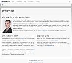
The biggest changes were made to the design of the website. I mentioned in a previous blog post that I've never been satisfied with the original design. It looked pretty boring:
So I went for a darker look with this new version. While I'm not great at designing websites, I'm pretty satisfied with how everything turned out. Mostly because it matches what I originally had in mind.
The changes
As mentioned above, the biggest changes were made to the design. Aside from a darker look, a panel has been placed on the left containing personal and contact information. This means you no longer have to navigate to a separate page for this information.
The website now uses Bootstrap 4 as well. This means Internet Explorer 9 and older are no longer supported.
I've also disabled the guestbook. It was mostly used for spam anyway, which thankfully was not visible since I have to approve every post first. The contact form was not used for spam, but I added better spam detection anyway. Apparently bots can beat Google Captcha now. 😃
There is a new page that contains some interesting links. Also, external links now open in a new window and have an icon that shows it is an external link.
For more information about the changes, go to the technical page.
What's next?
Now that the new version has been released I'm planning to add a few extra projects to the portfolio pages. I've got two old projects I had worked on in school that might be interesting. The same goes for several projects I have worked on at my work. Of course I can't go into detail with those projects, but I can talk about the experience I gained when working on them. So don't forgot to come back later and take a look!

